

TL;DR
- 73% of customer health scores fail to predict churn because they measure activity instead of risk, or they update too slowly to act on.
- A predictive health score combines five signal categories: product usage, support friction, engagement patterns, sentiment, and commercial indicators — weighted by what actually drives churn in your business.
- Backtest every score against historical churn data before deploying. A score that flags fewer than 60% of future churners is not predictive enough to act on.
- Recalculate scores weekly, not monthly. The early warning window is 60 to 90 days. A monthly refresh misses half of it.
- Fairview connects CRM, product usage, and finance data to surface churn risk signals in the weekly operating report — with named next actions for the customer success team.
Most customer health scores are built backward. Teams start with the data they have — logins, support tickets, NPS — assign arbitrary weights, and call it a score. Then they are surprised when a customer with a 92 health score cancels the next week. A 2025 study by ChurnZero found that 73% of health scores do not reliably predict churn. The reason is not bad data. It is bad architecture. This article covers how to build a customer health score that actually predicts churn 60 to 90 days in advance: the signal categories, the weighting method, the validation test, and the six mistakes that break most scores before they are deployed.
The difference between a decorative health score and a predictive one is simple. A decorative score tells you what happened. A predictive score tells you what is about to happen. The gap between those two is the difference between a customer success team that reacts to cancellations and one that prevents them.
If you have already read our guide to net revenue retention, this article is the operational layer underneath it. NRR is the outcome. Health scoring is the early warning system that protects it.
What a customer health score actually is
Definition
Customer health score: a composite metric that combines multiple behavioral, operational, and commercial signals into a single number that predicts the probability of churn, expansion, or renewal within a defined time horizon — typically 60 to 90 days. A predictive health score is validated against historical outcomes, not intuition.
A health score is not a report card. It is not a measure of how much a customer likes your product, how active they are, or how many features they have tried. Those are inputs. The score itself is a probability estimate dressed up as a number. Its only job is to rank customers by risk so the customer success team knows where to spend their time this week.
The architecture matters more than the math. A score built from ten signals with the wrong weights is less useful than a score built from three signals with the right ones. The most common failure mode is signal bloat: teams add every metric they can find, assign equal weights, and produce a score that averages out to mediocrity for every customer. The result is a score that never moves far from the middle, and a team that learns to ignore it.
The time horizon matters too. A score that predicts churn in 7 days is useless — the customer has already decided. A score that predicts churn in 12 months is equally useless — too many variables change. The productive window is 60 to 90 days. That is long enough to run an intervention playbook and short enough that the signals are still reliable.
Most B2B SaaS companies discover they need a real health score after their first surprise churn from a "healthy" account. The account had no open tickets, the champion was responsive, and the usage looked steady. Then the renewal did not come in. Post-mortem analysis reveals the real signals were there: a second user had stopped logging in three months ago, the contract value had been flat for two renewal cycles, and a competitor had been mentioned in the last quarterly business review. A well-built score would have surfaced all three.
The 5 signal categories that predict churn
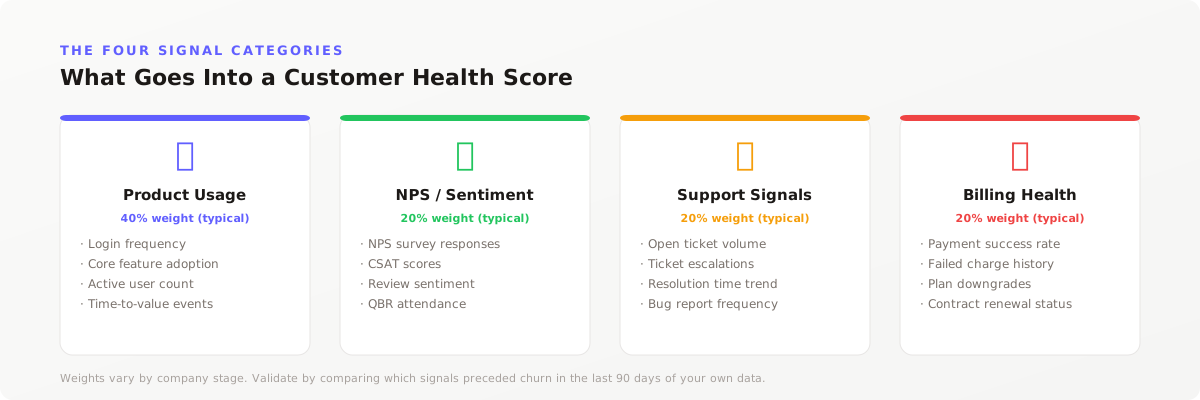
Every predictive health score draws from five categories of signals. The exact metrics within each category vary by product type and contract size, but the categories themselves are consistent across B2B SaaS. Here is what each one measures, why it matters, and the specific metrics to track.
1. Product usage
Product usage is the strongest single predictor of churn. A customer who stops using the product will not renew. The question is which usage signals matter and which are noise.
The metrics that predict churn are not total logins or page views. They are pattern changes. A customer who logged in daily for six months and now logs in weekly is at higher risk than a customer who has always logged in weekly. The signal is the delta, not the level.
Track these specific usage signals:
- Login frequency trend. Week-over-week or month-over-month change in active user days, not total sessions.
- Core feature adoption. Usage of the features that correlate with retention in your product. For a CRM, this might be pipeline creation and deal stage changes. For an analytics tool, it might be dashboard creation and scheduled report views.
- Time-to-value completion. Whether the customer has completed the onboarding sequence that your retained customers typically finish within 14 days.
- User seat utilization. The percentage of purchased seats that are active. A drop from 80% to 40% active seats is a stronger churn signal than a flat 50%.
- Integration depth. Number of connected data sources or integrations. Customers with three or more integrations churn at roughly half the rate of customers with none.
2. Support friction
Support activity is a dual signal. A customer with zero tickets might be self-sufficient or disengaged. A customer with ten tickets might be deeply invested or deeply frustrated. The predictive value comes from the pattern, not the count.
Track these support signals:
- Ticket volume trend. A spike in tickets after a period of stability often precedes churn. The customer has hit a wall.
- Ticket resolution time. Long resolution times correlate with churn more strongly than ticket volume. A customer who waits five days for a fix that was promised in one loses confidence fast.
- Escalation rate. The percentage of tickets that escalate to a senior engineer or manager. Repeated escalations signal that the standard support path is not resolving the customer's issues.
- Sentiment in ticket text. Natural language analysis of support tickets can detect frustration before it shows up in a survey. Keywords like "again," "still," and "frustrated" are leading indicators.
3. Engagement patterns
Engagement measures the relationship between your team and the customer outside of product usage. It captures the human layer that product data misses.
Track these engagement signals:
- Meeting attendance rate. For high-touch accounts, declining attendance at quarterly business reviews or check-in calls is a strong churn predictor.
- Email response rate. The percentage of customer success outreach emails that receive a response. A drop from 80% to 30% response rate signals disengagement.
- Champion activity. Whether the primary champion — the person who signed the contract and drove adoption — is still active in the account. Champion departure is one of the highest-weight churn signals in B2B SaaS.
- Stakeholder breadth. The number of unique contacts engaging with your product and team. Single-threaded accounts churn at 2 to 3 times the rate of multi-threaded accounts.
4. Sentiment and relationship depth
Sentiment data captures what customers say, not just what they do. It is the slowest signal to collect but often the most direct.
Track these sentiment signals:
- NPS or CSAT trend. A declining NPS score over two consecutive quarters predicts churn more reliably than a single low score. The trend matters more than the level.
- Qualitative feedback themes. Recurring themes in surveys, reviews, and call notes. "Too expensive," "missing feature X," and "considering alternatives" are direct churn signals.
- Reference willingness. Whether the customer has agreed to be a reference or case study in the past 12 months. A customer who previously agreed and now refuses is often evaluating alternatives.
- Relationship tenure with CSM. A change in customer success manager can reset relationship capital. Accounts within 90 days of a CSM change show elevated churn risk.
5. Commercial indicators
Commercial data is the most underused signal category in health scoring. It is also one of the most predictive. A customer's financial behavior with you is a direct read on their commitment.
Track these commercial signals:
- Payment failure rate. Multiple failed payments in a 30-day window predict churn with high confidence. The customer is either in financial distress or has already decided to leave.
- Contract value trend. Flat or declining contract value over two renewal cycles signals that the customer is not expanding their use of your product. Stagnant accounts churn at higher rates than growing ones.
- Plan downgrade history. A downgrade from annual to monthly billing, or from a higher tier to a lower tier, is often the first visible step toward cancellation.
- Invoice dispute rate. Repeated invoice disputes or billing inquiries signal friction in the commercial relationship that product usage data will not capture.
Key insight
The signal that predicts churn in a $50K ACV enterprise account is not the same as the signal that predicts churn in a $500 ACV self-serve account. Enterprise churn is driven by champion departure and contract friction. Self-serve churn is driven by time-to-value failure and payment issues. Build segment-specific models, not one score for all customers.
How to weight your signals
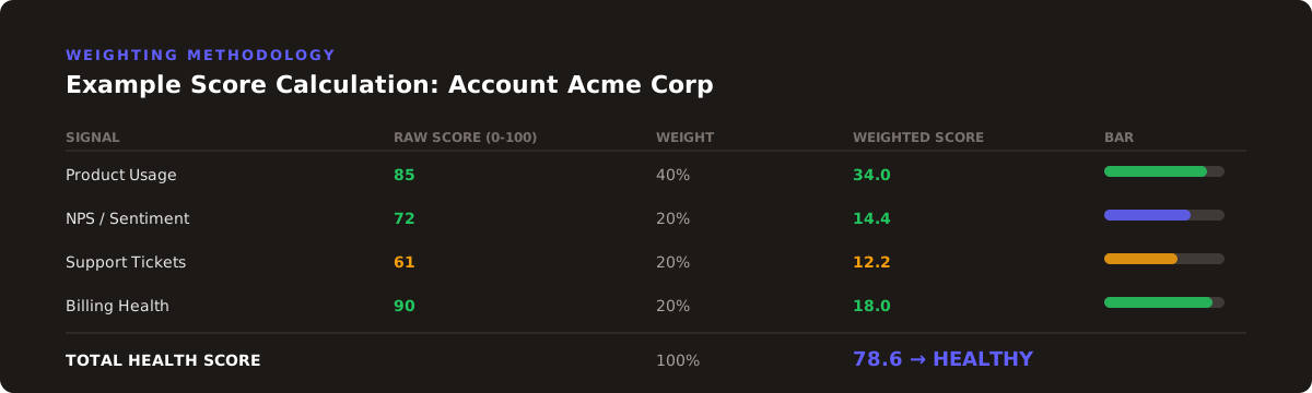
Signal selection is the first half of the problem. Signal weighting is the second. Most teams assign equal weights or intuitive weights and discover later that their score does not correlate with actual churn. The correct method is outcome-driven weighting: let the historical data tell you which signals matter.
Here is the process. Take your last 12 to 24 months of churn data. For every customer who churned, record their signal values at 60 and 90 days before the churn date. For a control group of customers who renewed, record the same signal values at the same relative time points. Then run a correlation analysis or logistic regression to determine which signals differentiate churned customers from retained customers.
The output is a set of weights that reflect your actual business, not a generic template. A typical B2B SaaS company with mid-market contracts will see weights in this range:
| Signal category | Typical weight | Why it varies |
|---|---|---|
| Product usage | 35% to 45% | Higher for product-led growth. Lower for services-heavy implementations. |
| Support friction | 15% to 20% | Higher for complex products with steep learning curves. |
| Engagement patterns | 15% to 20% | Higher for high-touch sales models with dedicated CSMs. |
| Sentiment | 10% to 15% | Higher when survey response rates are above 40%. Lower when sentiment data is sparse. |
| Commercial indicators | 10% to 15% | Higher for subscription businesses with monthly billing. Lower for annual upfront contracts. |
Do not round the weights to nice numbers. If product usage is 37% and support friction is 18%, use those numbers. The precision matters when you are ranking hundreds of accounts. A score that rounds everything to 20% will produce clusters of customers with identical scores, defeating the purpose of ranking.
One exception: cap the weight of any single signal at 50%. A score dominated by one signal is fragile. If that signal has a data outage or a product change that alters its meaning, the entire score becomes unreliable. Diversification applies to health scores the same way it applies to portfolios.
Building the scoring model
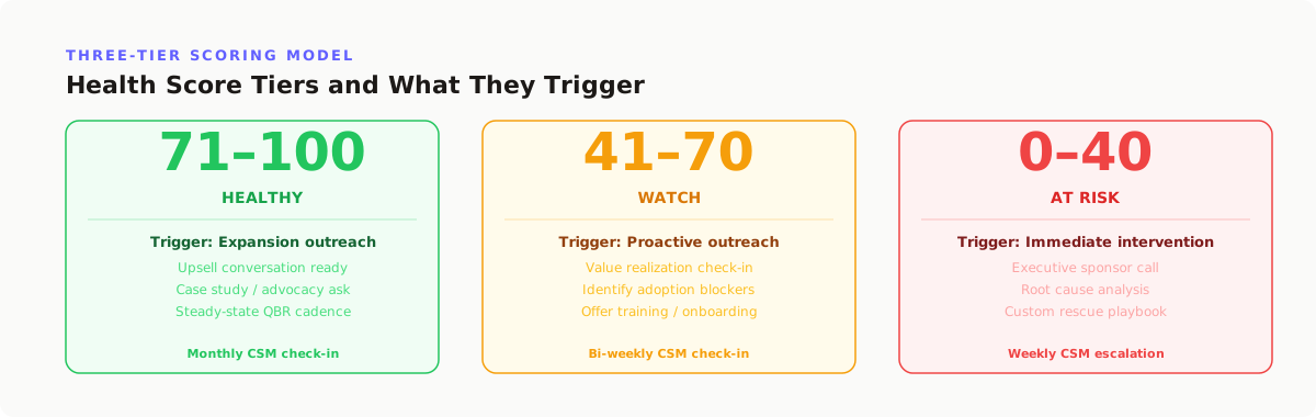
Once signals and weights are defined, the scoring model itself is straightforward. The challenge is making it operational — a system that updates automatically and produces actionable output, not a spreadsheet that someone updates on Fridays.
Here is the step-by-step build process:
Step 1: Normalize each signal to a 0 to 100 scale. Every signal needs to be on the same scale before weighting. A login frequency of 12 days per month and an NPS of 45 are not comparable as raw numbers. Normalize each signal by defining the worst-case value as 0 and the best-case value as 100, with a linear or logarithmic interpolation between them. For example, if the worst login frequency in your base is 0 days per month and the best is 22 days, a customer with 11 days gets a 50 on that signal.
Step 2: Apply the weights. Multiply each normalized signal by its weight and sum the results. If product usage is 40% weight and a customer scores 80 on product usage, that contributes 32 points to the total score. Repeat for each signal category.
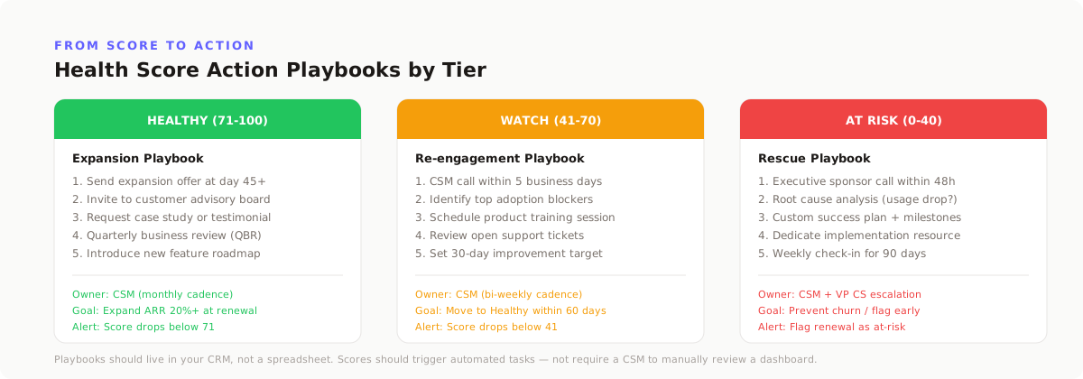
Step 3: Define the risk bands. Most teams use three bands on a 0 to 100 scale:
- 0 to 40: At-risk. Immediate intervention required. The CSM should schedule a call within 48 hours.
- 41 to 70: Neutral. Added to a watch list with a follow-up date. No immediate action unless other signals worsen.
- 71 to 100: Healthy. Standard engagement rhythm. Monitor for score changes but do not allocate extra resources.
The thresholds should be calibrated to your actual churn rate. If 20% of your customers churn annually, your at-risk band should capture roughly 25% to 30% of your base. That gives the team a manageable intervention list without creating alert fatigue. If the at-risk band captures 60% of customers, the team will ignore it. If it captures 5%, it will miss too many churners.
Step 4: Build the intervention playbook. Each risk band needs a specific action. The at-risk playbook might include: schedule an executive business review, identify a new champion, offer a training session, or propose a contract adjustment. The neutral playbook might include: send a targeted content piece, invite the customer to a webinar, or schedule a quarterly check-in. The healthy playbook is simply: maintain the current engagement rhythm and watch for score changes.
Step 5: Automate the calculation. The score should update automatically as new data arrives. This requires connecting your product analytics, CRM, support system, and billing platform to a single computation layer. For early-stage companies, this can be a scheduled script that runs daily or weekly. For scale-stage companies, it should be a real-time pipeline that updates scores within hours of a signal change.
For more on connecting data sources into a unified view, see our guide to connected data in business.
Validating your score against real churn data
A health score that has not been validated is a hypothesis, not a tool. Validation means testing whether the score actually predicted the churns that happened. There are two tests every score must pass before deployment.
Test 1: Backtest accuracy. Take every customer who churned in the past 12 months. Calculate what their health score would have been at 60 and 90 days before their churn date, using only data that was available at that time. Then measure what percentage of churned customers scored in the at-risk band. A score that flags fewer than 60% of future churners is not predictive enough to act on. A score that flags 80% or more is strong.
Test 2: False positive rate. Of the customers who scored in the at-risk band, what percentage actually churned? If 100 customers score at-risk and only 10 churn, the team is wasting time on 90 false alarms. A false positive rate above 70% creates alert fatigue and erodes trust. The target is a false positive rate below 50% — meaning at least half of the at-risk flagged accounts are genuinely at risk.
The backtest should be run on a holdout set — customers the model was not trained on. Training and testing on the same data produces overfitted scores that look great in validation and fail in production. Split your historical data 70/30: train the weights on 70%, validate on the remaining 30%.
Retrain the model every 90 days. Customer behavior changes. Product features change. Competitive dynamics change. A score built in Q1 and left unchanged through Q4 will drift in accuracy. The 90-day retraining cycle keeps the weights aligned with current reality.
The 6 mistakes that break health scores
After reviewing dozens of health score implementations, we see the same six mistakes repeatedly. Each one is avoidable.
Mistake 1: Using activity as a proxy for health. A customer who logs in every day is not necessarily healthy. They might be struggling with a bug and logging in repeatedly to check if it is fixed. Activity without outcome is noise. The signal that matters is whether the customer is getting value from the product, not whether they are clicking buttons.
Mistake 2: Equal weighting. Not all signals are equally predictive. Assigning 20% to each of five categories assumes you know nothing about your own churn drivers. The data knows more than your intuition. Let the historical outcomes set the weights.
Mistake 3: Monthly refresh cycles. A health score that updates monthly misses the early warning window. By the time the monthly score shows a drop, the customer has already been at risk for weeks. Weekly recalculation is the minimum viable frequency. Daily is better for high-velocity businesses.
Mistake 4: One score for all segments. A health score built for enterprise customers will fail on self-serve accounts and vice versa. The signals, weights, and thresholds should be segment-specific. At minimum, build separate models for high-touch and low-touch segments. Ideally, build segment-specific models for each major customer category.
Mistake 5: Ignoring the intervention playbook. A score without actions is a dashboard, not a tool. The team needs to know exactly what to do when a customer hits the at-risk band. Without a playbook, the score produces anxiety without resolution. Build the playbook before deploying the score.
Mistake 6: No validation loop. Teams deploy a score, trust it for six months, and then discover it missed half the churns. The fix is a quarterly validation review: compare the score's predictions to actual outcomes, adjust weights, and refine thresholds. A health score is a living model, not a one-time project.
How Fairview surfaces churn risk
Fairview connects CRM, product usage, finance, and support data into one operating view. For customer health scoring, this means the signals that typically live in four separate tools — login frequency in product analytics, ticket volume in Zendesk, contract value in the CRM, payment status in Stripe — are visible in one place.
- Operating Dashboard. One screen with churn risk signals, account health trends, and anomaly alerts. Replaces the manual process of checking four tools to build a health picture.
- Next-Best Action Engine. Detects patterns in connected data — declining logins, payment failures, champion inactivity — and generates specific, named recommendations. Not just "this account is at risk" but "schedule a business review with the new VP of Operations who was added to this account 14 days ago."
- Weekly Operating Report. Summarizes the prior week's churn risk changes, highlights the top 3 accounts that moved into the at-risk band, and lists the previous week's interventions and their outcomes.
When a customer's health signals cross the threshold, Fairview writes a named next-best action into the weekly operating report. The same rhythm that keeps the forecast honest also surfaces churn risk earlier than a stitched-together spreadsheet would catch.
Key takeaways
- A customer health score is a probability estimate, not a report card. Its only job is to rank customers by churn risk so the team knows where to spend time.
- The five signal categories are product usage, support friction, engagement patterns, sentiment, and commercial indicators. Product usage carries the highest weight at 35% to 45% for most B2B SaaS companies.
- Weights must be derived from historical churn data, not intuition. Backtest the score against real outcomes and aim to flag 80% or more of future churners in the at-risk band.
- Recalculate scores weekly at minimum. Monthly refreshes miss the 60 to 90 day early warning window that makes health scoring valuable.
- Build segment-specific models, not one score for all customers. Enterprise churn is driven by different signals than self-serve churn.
Conclusion
A customer health score that actually predicts churn is not a dashboard widget. It is a validated model with segment-specific weights, automated recalculation, and an intervention playbook attached to each risk band. The 73% of scores that fail do so because they skip one or more of those steps. The 27% that succeed follow the same pattern: they let the data set the weights, they validate against real outcomes, and they treat the score as a living model that gets retrained every quarter.
The question worth asking is not whether you have a health score. It is whether your score would have flagged your last three surprise churns 60 days before they happened. If the answer is no, the next move is backtesting — not adding more signals.