TL;DR
- A weekly operating report is a structured document that summarizes the prior week's performance across revenue, margin, pipeline, and operations — readable in under 10 minutes and designed to produce decisions.
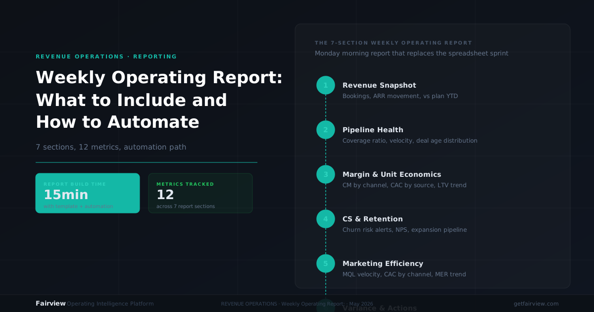
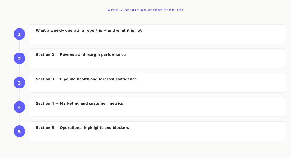
- The report contains seven sections: executive summary, revenue and margin, pipeline and forecast, marketing and customer metrics, operational highlights, action items, and next week's priorities.
- Each metric needs three data points: the target, the actual, and the variance from prior period. Metrics without all three are observations, not operating signals.
- The report should be compiled by one person — COO, VP of Operations, or RevOps lead — who resolves conflicts between sources and writes one unified view.
- Fairview generates this report automatically every Monday morning from connected CRM, finance, and e-commerce data — so operators arrive at the review already briefed, not assembling numbers.
Most operators spend Monday morning assembling data from five different tools instead of acting on it. The weekly operating report is the document that fixes this — if it is structured correctly. This post gives you the complete template: what goes in each section, which metrics matter, and how to write a report that produces decisions instead of awareness.
The problem is not that operators lack data. It is that the data lives in disconnected systems, uses inconsistent definitions, and arrives in formats that require manual reconciliation before anyone can act on it. A McKinsey study found that employees spend 1.8 hours per day — over 9 hours per week — searching for and gathering information. For operators running a Monday review, much of that time goes into building the report instead of reading it.
A well-designed weekly operating report does three things. It surfaces what changed. It flags what requires action. It assigns who owns the action. Everything else is noise. This article covers the seven-section structure, the 12 metrics that belong in each, and the discipline that keeps the report useful week after week.
What a weekly operating report is — and what it is not
A weekly operating report is a structured document that summarizes the prior week's business performance across revenue, margin, pipeline, and operations. It is designed to be read in under 10 minutes. Its purpose is to produce decisions, not awareness.
It is not a status update. Status updates describe what happened. Operating reports identify what to do next. It is not a financial report — those run monthly and cover accruals, reconciliations, and board-level metrics. It is not a dashboard — dashboards show real-time data; operating reports show week-over-week changes with context. And it is not a slide deck — slides are for presentations; operating reports are for reading.
The distinction matters because most teams conflate these formats. They build a slide deck that contains dashboard screenshots, add a narrative summary that reads like a status email, and call it an operating report. The result is a document that takes two hours to prepare, 20 minutes to read, and produces no clear action. The template below prevents this by enforcing structure at the section level.
For operators who also run a formal revenue review meeting, the weekly revenue review template covers the meeting agenda that uses this report as its foundation. This article stays focused on the document itself.
Section 1 — Executive summary: three insights, no narrative
The executive summary is the most important section and the most commonly botched. Most authors use it to write a paragraph describing the week. The correct approach is three bullet points, each containing a single insight that would change a decision if the reader knew nothing else.
A good executive summary looks like this:
- Revenue: Closed revenue was $218K vs. a $240K target (-9.2%). The miss came from two enterprise deals slipping into next week. Both remain in Stage 4 with active engagement.
- Margin: Blended contribution margin improved from 34% to 36% due to lower ad spend on underperforming Meta campaigns. Two campaigns were paused on Wednesday.
- Action required: Pipeline coverage dropped from 3.6x to 3.1x over two weeks. Marketing needs to generate $400K in new pipeline by Friday to restore coverage before month-end.
Notice what each bullet contains: a metric, a variance, and a specific cause or action. Notice what it does not contain: general observations, forward-looking optimism, or explanations that do not change a decision. The executive summary is not a warm-up. It is the conclusion, placed at the top so time-pressed readers get the full picture in 60 seconds.
The three-bullet limit is intentional. If there are more than three insights worth surfacing, the author has not prioritized. If there are fewer than three, the week was either unusually quiet or the author is not looking hard enough. Both are worth flagging.
Section 2 — Revenue and margin performance
This section contains the financial core of the report. It answers two questions: did we make the revenue number, and did we make it profitably. Every metric in this section needs three data points: target, actual, and variance from prior period.
| Metric | Target | Actual | Prior Period | Owner |
|---|---|---|---|---|
| Revenue closed (week) | $240K | $218K | $255K | RevOps |
| Revenue closed (quarter to date) | $720K | $698K | $680K | RevOps |
| Gross margin | >55% | 57% | 56% | Finance |
| Contribution margin | >30% | 32% | 30% | Finance |
| Operating expenses (week) | <$85K | $82K | $88K | Finance |
The targets in this table are illustrative. Set yours based on your quarterly plan, historical averages, and the specific economics of your business model. What matters is consistency: the same metrics, tracked the same way, every week. Changing the metrics mid-quarter destroys comparability and makes trend detection impossible.
For operators who want to go deeper on margin calculation, the margin intelligence guide covers the four layers beyond gross margin — contribution margin, channel-level margin, SKU-level margin, and customer cohort margin — and how to calculate each one.
A critical discipline: this section shows actuals, not forecasts. The forecast lives in Section 3, where it is compared against pipeline reality. Mixing forecast and actual in the same table creates confusion about which numbers are confirmed and which are projected.
Section 3 — Pipeline health and forecast confidence
This section connects the revenue number to its source: the pipeline. It answers whether the current quarter's target is achievable given the deals in progress, and whether the forecast model is improving or degrading in accuracy.
| Metric | Target | Actual | Prior Period | Owner |
|---|---|---|---|---|
| Pipeline coverage ratio | 3.5x | 3.1x | 3.6x | Sales |
| Weighted pipeline value | $1.2M | $1.05M | $1.18M | Sales |
| Deals at risk | <3 | 5 | 2 | Sales |
| Win rate (quarter) | 22% | 19% | 21% | Sales |
| Forecast confidence | High | Medium | High | RevOps |
The pipeline coverage ratio is the most predictive metric in this section. It measures total open pipeline divided by the quarterly revenue target. A ratio of 3.5x means you need $3.50 in pipeline for every $1.00 in target, given your win rate. If your win rate is 20%, you need 5x coverage. If your win rate is 40%, 2.5x is adequate. The key is the trend: coverage dropping from 3.6x to 3.1x over two weeks signals that pipeline generation is not keeping pace with closures, even if the absolute number still looks acceptable.
Forecast confidence is a qualitative rating — High, Medium, or Low — assigned by the RevOps lead based on pipeline composition. High confidence means the deals in late stages are with known accounts, have active engagement, and have not slipped close dates. Low confidence means the quarter depends on a few large deals with uncertain timing. The rating forces the team to confront uncertainty explicitly rather than hiding it behind a single forecast number.
For a deeper treatment of pipeline metrics, see the guide on pipeline health metrics — coverage, velocity, stage conversion, and the quality signals that predict outcomes before deals close.
Section 4 — Marketing and customer metrics
This section tracks the inputs that feed the pipeline and the outputs that determine long-term revenue health. Marketing metrics show whether demand generation is on track. Customer metrics show whether the existing base is stable or at risk.
| Metric | Target | Actual | Prior Period | Owner |
|---|---|---|---|---|
| Marketing qualified leads | 120 | 95 | 110 | Marketing |
| Cost per qualified lead | <$180 | $195 | $172 | Marketing |
| New pipeline created | $800K | $640K | $720K | Marketing |
| Churn rate (monthly) | <2% | 1.8% | 1.6% | CS |
| Net revenue retention | >105% | 103% | 104% | CS |
The marketing metrics in this table are for a B2B SaaS company with an inbound motion. A D2C company would substitute ad spend by channel, MER, and ROAS. A services company would substitute utilization rate and project pipeline. The structure — target, actual, prior period, owner — stays the same regardless of business model.
The customer metrics — churn and net revenue retention — are leading indicators of revenue stability. A monthly churn rate of 1.8% compounds to an annual rate of roughly 20%. That means one in five customers leaves every year. For a company with $5M ARR, that is $1M in revenue that must be replaced just to stand still. Tracking churn weekly catches spikes early, before they show up in the quarterly board deck.
For operators focused on D2C metrics, the D2C unit economics guide covers the 13 metrics every brand must track, including channel-specific CAC, contribution margin by channel, and the cohort view that separates real growth from tax.
Section 5 — Operational highlights and blockers
This section captures what happened in operations that affects revenue, margin, or the team's ability to execute. It is not a laundry list of every meeting and decision. It is a curated set of items that either changed the operating environment or require cross-functional attention.
Each item follows a standard format:
- What happened: One sentence describing the event
- Impact: The specific effect on revenue, margin, or execution capacity
- Status: Resolved, in progress, or blocked — with the blocker named if applicable
Example of a well-formed operational highlight: "The QuickBooks integration experienced a data sync delay on Wednesday. Three days of Stripe transactions were not reflected in the margin calculation until Friday. Impact: the contribution margin shown in Monday's report was understated by 2 percentage points. Status: resolved. The sync is now running on a 4-hour cadence instead of daily."
Example of a poorly formed highlight: "Had a good week on the operations side." The first version contains a specific event, a quantified impact, and a resolution. The second contains no information that would change a decision.
Blockers deserve their own subsection. A blocker is a cross-functional obstacle that prevents revenue from closing or margin from improving. Each blocker needs four elements: what is blocked, who is affected, what is needed to unblock it, and who owns the resolution. Blockers without owners are complaints. Blockers with owners and deadlines are requests.
Section 6 — Action items: completed vs. open
This section tracks the promises made in prior weeks. It has two parts: actions completed since the last report, and actions still open with their current status.
| Action | Owner | Due | Status |
|---|---|---|---|
| Review Meta campaigns with ROAS under 1.5x | Marketing lead | May 19 | Complete |
| Re-engage 3 stalled Stage 4 deals | Sales lead | May 20 | Complete |
| Fix HubSpot-Stripe attribution gap | RevOps lead | May 21 | In progress |
| Assign dedicated legal reviewer for $50K+ deals | Sales lead | May 22 | Blocked |
The action items table serves a meta-purpose: it measures execution quality. A team that completes 90% of assigned actions is a team that makes commitments and keeps them. A team that completes 40% has a credibility problem that no amount of pipeline coverage can fix. The completion rate is a leading indicator of organizational health — more predictive than most financial metrics.
Actions that remain open for more than two weeks are escalated. Either the action was not important enough to assign, or the owner does not have the authority or capacity to complete it. Both are management problems, not execution problems. The report surfaces them so they can be resolved.
Section 7 — Next week's priorities
The final section looks forward. Each function lead states their top one or two priorities for the coming week. Not a task list. Not a project roadmap. The one or two things that, if completed, will most improve the operating number seven days from now.
The format is specific: "[Function] will [specific action] by [date], which will [expected outcome]." Example: "Marketing will launch the retargeting campaign for Q2 pipeline by Wednesday, which will generate an estimated $150K in new pipeline by month-end." Example of a poorly formed priority: "Marketing will work on campaigns this week."
Priorities are captured in the report and reviewed at the start of next week's action items section. Priority stated but not completed gets a one-sentence explanation. Priority completed gets checked off. The accumulation of checked priorities over four weeks is a signal that the team is executing — or that it is not.
This section also prevents the common failure mode where every function operates on its own timeline, optimized for local metrics rather than business outcomes. When marketing's priority is "launch the webinar series" and sales's priority is "close the three deals at risk," the group can see whether those priorities are aligned. If they are not, the discussion happens in the review meeting, not at the end of the quarter when the numbers are final.
Common mistakes in weekly operating reports
Even with the right template, weekly operating reports fail for predictable reasons. Here are the five most common mistakes and how to avoid each one.
Mistake 1: Including too many metrics
The report becomes a data dump. Twenty metrics, each with a paragraph of explanation. The reader cannot identify what matters. The fix: limit the report to 12 metrics maximum. If a metric does not have a target, an actual, and a clear owner, it does not belong in the report. Supplementary metrics live in a dashboard, not in the weekly document.
Mistake 2: Writing narrative instead of insight
The executive summary reads like a journal: "This week was busy. We had several important meetings and made good progress on key initiatives." No metric. No variance. No action. The fix: every sentence in the executive summary must contain a number or a named action. If it does not, delete it.
Mistake 3: No owner for each metric
A metric appears in the report but nobody is accountable for it. When the number misses, everyone shrugs. The fix: every metric has an owner. The owner is responsible for updating the number before the report is compiled and explaining variances over 10%. No metric without an owner. No owner without a number.
Mistake 4: Changing the format week to week
One week the report has 10 metrics. The next week it has 18. One week the executive summary is three bullets. The next week it is a paragraph. The inconsistency makes week-over-week comparison impossible. The fix: lock the format for the quarter. Changes happen at quarter boundaries, not mid-stream.
Mistake 5: Distributing without a review meeting
The report is emailed to 15 people. Nobody reads it. Nobody acts on it. It becomes a ritual, not a tool. The fix: the report feeds a single meeting — the weekly operating review — with six attendees or fewer. The meeting uses the report as its agenda. The report without the meeting is a document. The report with the meeting is an operating system.
How Fairview automates the weekly operating report
The template above works with any tool — a spreadsheet, a Notion doc, a BI dashboard. The discipline of the report matters more than the software. That said, the preparation work that precedes the report is where most teams lose time. Fairview is designed to eliminate that preparation work.
The Weekly Operating Report
Fairview generates a structured weekly report — sent to the operator's inbox every Monday morning before the review meeting. The report summarizes the prior week: revenue vs. forecast, margin vs. prior period, pipeline changes, and open action items. It highlights the top three anomalies or risks detected that week. It lists the previous week's actions, showing which are complete and which remain open.
The result: operators arrive at the Monday review already briefed. They do not spend the first 20 minutes assembling numbers. They spend the first 20 minutes making decisions.
Operating Dashboard
Fairview's Operating Dashboard aggregates data from connected sources — CRM, finance, e-commerce, marketing — into one view. Margin by channel, pipeline health, forecast confidence, and anomaly alerts are all visible before the report is compiled. The report author does not need to export from four tools and reconcile definitions. The data is already normalized.
Margin Intelligence
Fairview calculates contribution margin by channel, campaign, product line, and customer segment — not just gross revenue. The margin numbers in Section 2 of the report are computed automatically from Stripe, QuickBooks, or Xero data, with ad spend allocated by channel. Companies that use Fairview's Margin Intelligence recover an average of 23% of leaking margin in the first 90 days.
Next-Best Action Engine
The feature that most clearly separates Fairview from passive dashboards is the Next-Best Action Engine. When Fairview detects an anomaly — a margin drop on a specific channel, a cluster of at-risk deals, a churn signal — it generates a specific, named recommendation. Not a generic alert. A specific action: which campaign to review, which deals to prioritize, which account to check. These actions appear in the report and can be assigned to a team member before the meeting begins.
The honest scope
Fairview does not replace the report. It replaces the assembly work that makes the report late, inconsistent, and incomplete. The insights still require human judgment. The priorities still require leadership alignment. The blockers still require cross-functional negotiation. What changes is that the data is ready when the author sits down to write.
If your team spends more time assembling the weekly report than acting on it, the problem is not your people. It is the workflow. Fairview connects your CRM, finance, and e-commerce data into one operating view — and delivers a structured Weekly Operating Report to your inbox every Monday morning. Book a demo to see how it works for your stack.
Key takeaways
- A weekly operating report is a decision document, not a status update. It is designed to be read in under 10 minutes and to produce specific actions with owners and deadlines.
- The report contains seven sections: executive summary, revenue and margin, pipeline and forecast, marketing and customer metrics, operational highlights, action items, and next week's priorities.
- Every metric needs three data points: target, actual, and variance from prior period. Metrics without all three are observations, not operating signals.
- Limit the report to 12 metrics maximum. Supplementary metrics live in a dashboard. The report's job is prioritization, not comprehensiveness.
- The report should be compiled by one person with authority to resolve conflicts between sources. Individual function heads contribute numbers; the compiler writes the unified view.
- The report feeds a single meeting — the weekly operating review — with six attendees or fewer. Without the meeting, the report becomes a ritual. With the meeting, it becomes an operating system.
- Lock the format for the quarter. Changing metrics or structure mid-quarter destroys comparability and makes trend detection impossible.
What should a weekly operating report include?
A complete weekly operating report includes seven sections: an executive summary with the top three insights, revenue and margin performance versus prior period and target, pipeline health and forecast confidence, marketing and customer metrics, operational highlights and blockers, a completed versus open action items list, and next week's priorities with named owners. Each section contains specific metrics, not narrative descriptions.
How long should a weekly operating report be?
A well-designed weekly operating report should be readable in under 10 minutes. That translates to two pages for a written report, one screen for a dashboard view, or a single email digest. The constraint forces the author to surface what matters and omit what does not. Reports that run longer than this are usually hiding a lack of prioritization behind volume.
Who should write the weekly operating report?
The report should be compiled by one person — typically the COO, VP of Operations, or RevOps lead — who pulls data from each function and writes the unified view. Individual function heads contribute their section's numbers 24 hours before the report is due. The compiler's job is to resolve conflicts between sources, not to aggregate every number each function provides. The report has one author and one voice.
How is a weekly operating report different from a weekly revenue review?
The weekly operating report is a document. The weekly revenue review is a meeting. The report is distributed before the meeting and serves as the meeting's single source of truth. The meeting uses the report as its agenda. Without the report, the meeting becomes a live data pull. Without the meeting, the report becomes a document nobody acts on. The two are designed to work together: the report surfaces what to discuss, and the meeting decides what to do about it.